With about a week to go to the final submission for the project, there was a lot of work to be done. To recap, my group chose to work on NUS NextBus.
From Milestone 2
In our milestone 2, we conducted our user research to find out about user pain points.
One of the comments we received for milestone 2 was that our pain points were quite broad. We decided to scope down our pain points to make it clearer. For example, we wrote “Unclear Information” as a pain points. This was not a good pain point as it was (ironically) unclear. I started to wonder what was unclear about the application:
- Is there a missing feature?
- Is the layout that was unclear, such as the lack of visual hierarchy?
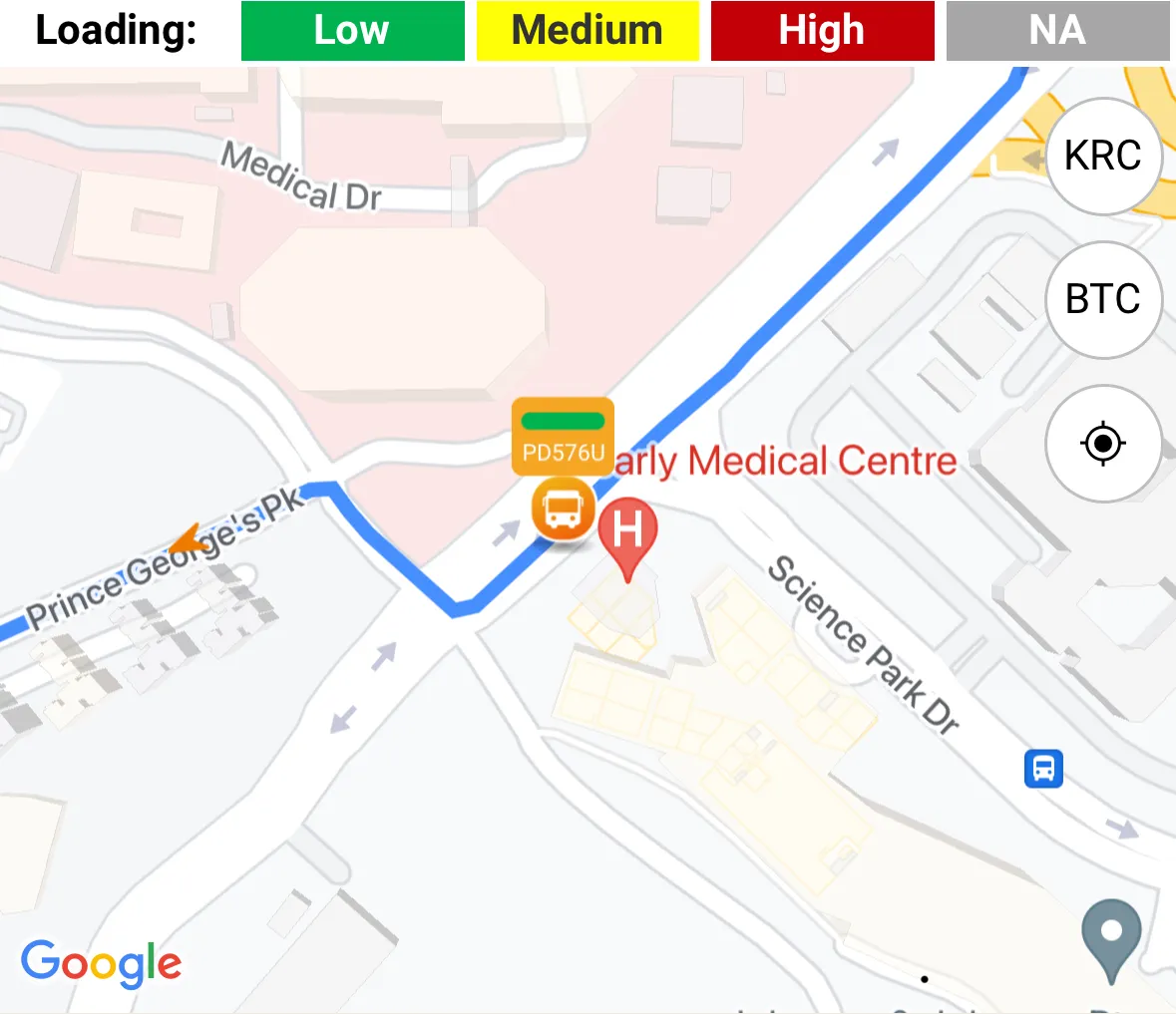
I found the content in this week’s class about the different types of visual hierarchy to be really helpful in my decision. Ultimately, I decided it was more of the latter, as some critical information for route planning was not clearly displayed. For instance, the bus occupancy was really small and difficult to see on the map, and many users did not notice this feature.
This highlighted the importance of coming up with clear and tangible pain points to design for.
User research as a foundation for design
With our user research, we moved into wireframes. We started with designing personas and scenarios to summarise key user behaviours and needs. I felt that this process helped my group bridge the gap from user research to design, in increasing our understanding of what features our users may require.
When coming up with the scenario, I thought deeper about the context NUS NextBus users use the application in. Users often use the application for a short period of time while on the go. This meant that our design has to involve a high level of contextual awareness, and during our group discussions, I proposed some features that I thought might help:
- Location awareness, for example when using the app to find directions, we can prefill the current location.
- Fuzzy searching for locations, since typing while moving is more error-prone, users should be able to find search results even when they make small errors.
This process helped to form the foundation of features and screens to design for. This is particularly important since NextBus is an application mostly used on mobile phones. In mobile devices, screen real estate is very precious and including only the key features is important to reduce cognitive load on the user.
Prioritising tasks
Time was tight for the upcoming milestone. One week to complete a wireframe, pitch and presentation is extremely challenging, though not impossible. This highlights the reality of working under tight deadlines in real-world design projects. It also underscored the importance of effectively distributing tasks among team members to meet the deadline, which we achieved by aligning to each person’s strengths and preferences.