This week, we wrapped up our group project. The bulk of the work done this week was on the wireframe and report. My group worked on redesigning NUS NextBus.
Finding inspiration
One significant pain point we identified was the lack of clear bus occupancy information for users. This prompted me to reflect on how other similar applications were addressing this issue, which led me to suggest competitor analysis to my group. This analysis was invaluable in increasing our understanding on the strengths and weaknesses of existing solutions and guide our decision on what features to incorporate into our redesign.
I examined how other applications displayed bus occupancy information and compared it to NUS NextBus. One application I looked at was SG BusLeh.
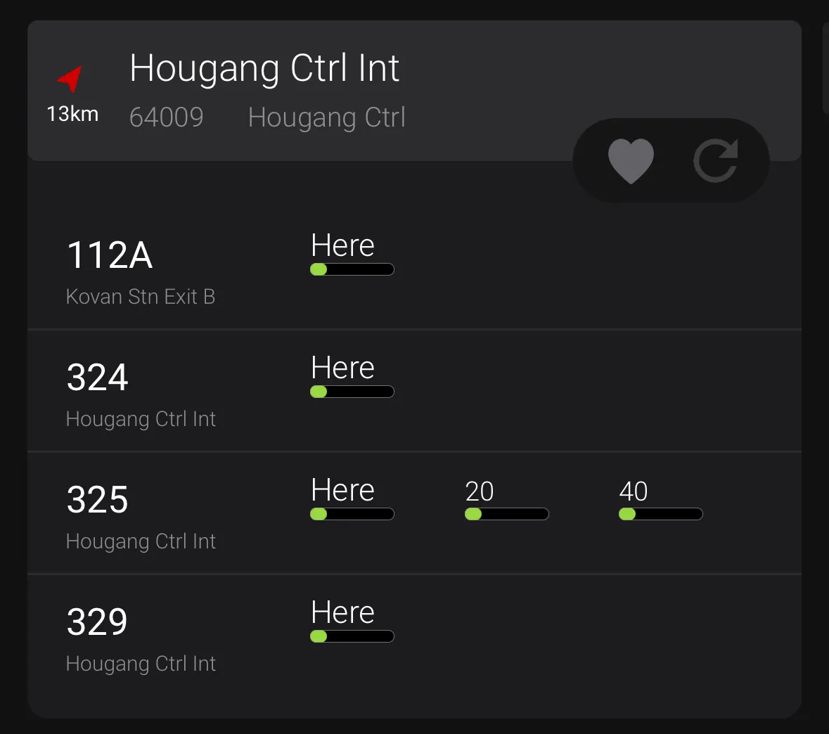
In comparison, this is NUS NextBus.
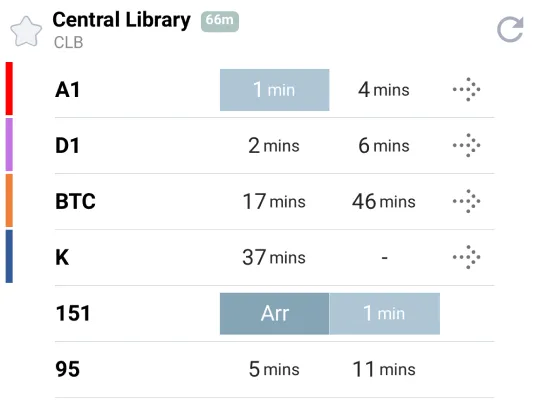
I found BusLeh’s bus occupancy information to be significantly more intuitive than NUS NextBus. NUS NextBus, however, seems to neglect this crucial detail on its timing pages. Initially, I mistakenly assumed the color of the bus timings indicated occupancy levels, but they only represent the arrival time. The bus occupancy information was only displayed in the mini-map below.
Upon further reflection, I realised that including this feature was essential for our redesign. Many other bus timing applications I looked at, including BusLeh, SG Buses all had a similar implementation of bus occupancy information. By obscuring occupancy information to another page, the existing application disrupted users’ mental model of typical bus timings application. Furthermore, according to our user research, the bus timings page is the most frequently accessed page. The lack of occupancy information on this page also hinders users’ journey planning, making NUS NextBus less user-friendly as a whole.
Iterative wireframing
While not required, my group developed multiple wireframes in an iterative process, progressively enhancing the design of each screen. This emphasised the iterative nature of design.
Throughout this process, my group encountered disagreements and engaged in discussions regarding various elements of our wireframe.
For example, I suggested moving the search bar on the directions page to the bottom to make it more accessible, based on what we learned in class about typical user reach. I felt that this change would improve usability by aligning with natural hand movements, especially on larger phones, where reaching the top of the screen may be difficult.
However, not everyone agreed with this approach. One concern raised was whether placing the search bar at the bottom might lead to accidental taps, particularly when users are navigating other elements of the page. This feedback made me reflect on the complexities of design decisions. While theoretical knowledge supports improving accessibility, practical concerns like unintended interactions must also be carefully considered.
Closing thoughts
Ultimately, I realised design is about users, not my personal preferences or ideas. Many of us, myself included, came into the project with pre-existing assumptions shaped by our prior experiences with NUS NextBus. It became clear that these assumptions could cloud our judgment, making it easy to overlook how other users interact with the app.